
WorkNo. 01
How I gave an AI company the look of an anatomy atlas.
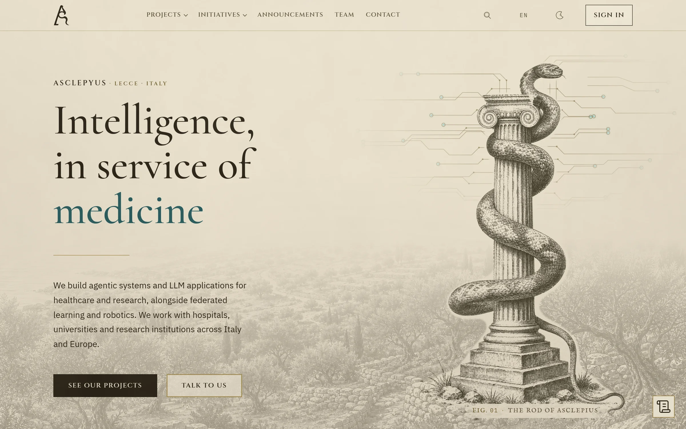
Asclepyus builds AI for hospitals and research, but its website looked like any start-up template. I led the redesign, which replaced the stock graphics with engravings. The new site has light and dark themes, runs in English and Italian, and has been live since August 2026.
The brief
Asclepyus, based in Lecce, builds agentic systems and LLM applications for healthcare and research, alongside federated learning and robotics. It works with hospitals, universities and research institutions, whose people need to trust a system before they’ll try it.
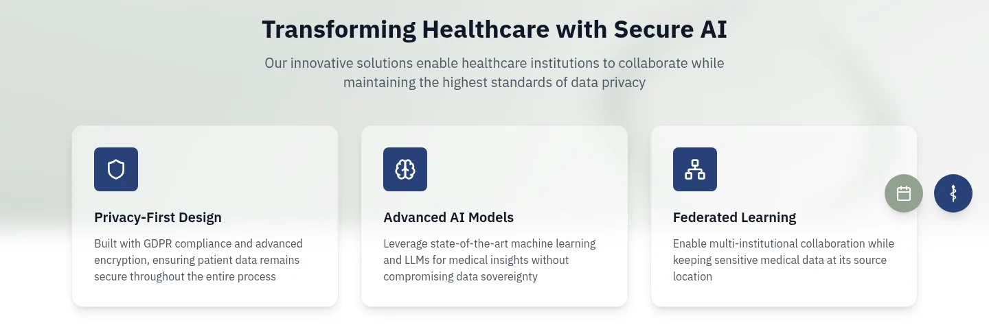
The first website was assembled in 2024 from a generic template: a long navigation bar, a glassy banner with the company name, the headline “Transforming Healthcare with Secure AI” and three identical cards with stock icons. Any AI start-up could have used the same page.
Before and after
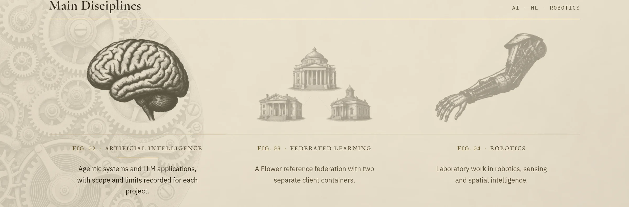
The same first screen of the home page, before and after the redesign.
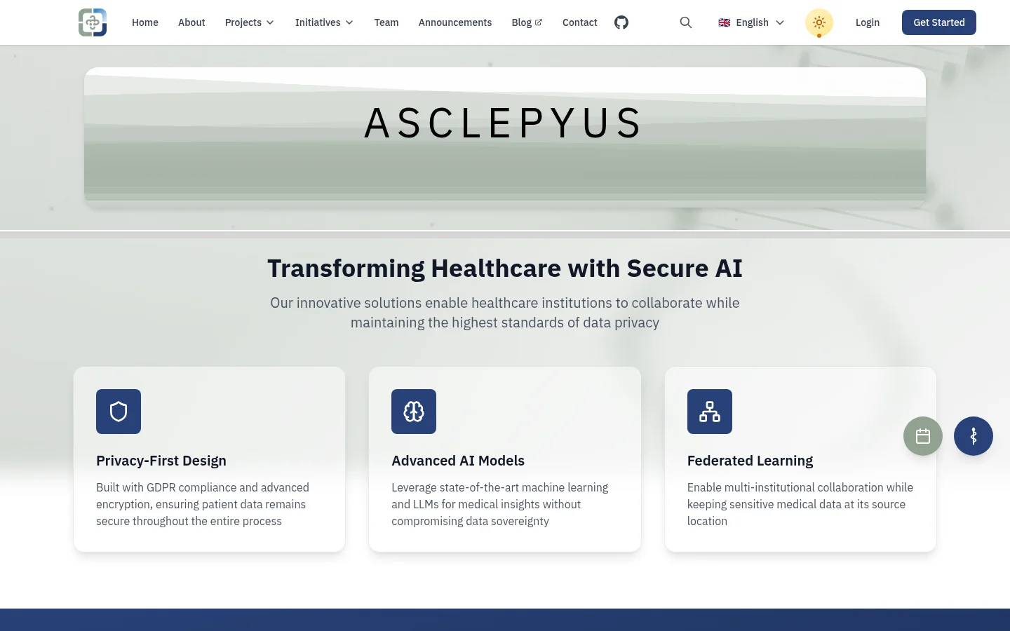
Fig. 1 is a local build of the last version before the redesign. Two bands between the banner and the headline were filled by live data and are left out of the capture.
The idea
A company that builds AI for medicine asks hospitals and researchers to trust a new technology with their work. Medicine already has images that people trust: the engraved plates of anatomy atlases and the rod of Asclepius. I built the identity from them, so the new technology is presented in the look of old medical books. The project took the name Atlas.
Four decisions
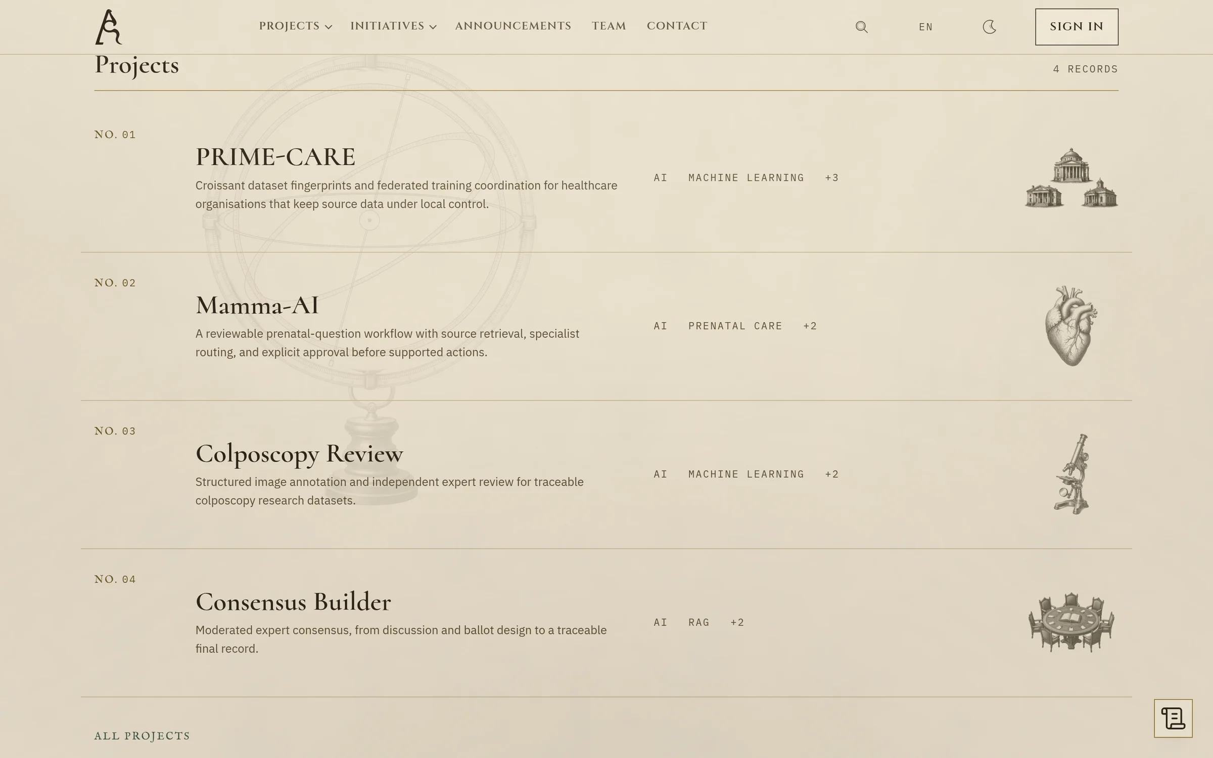
Engraving, drawn by hand, instead of stock illustration
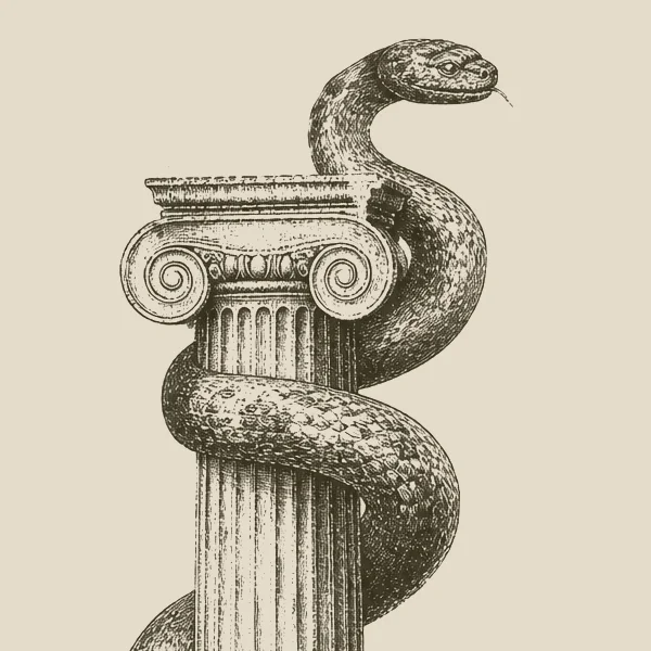
Most AI companies reach for 3D renders and gradients. Engraving takes longer to make, but it borrows the authority of the old atlases and doesn’t look like the usual AI start-up.
The plates were drawn by hand in Photoshop, then iterated on and refined with generative AI.
One drawing, two themes
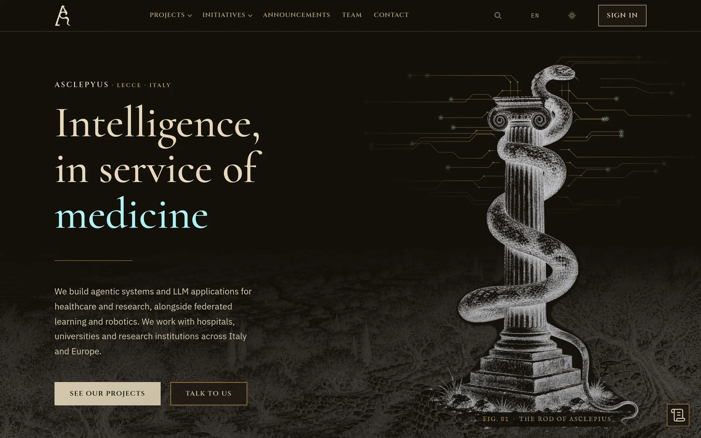
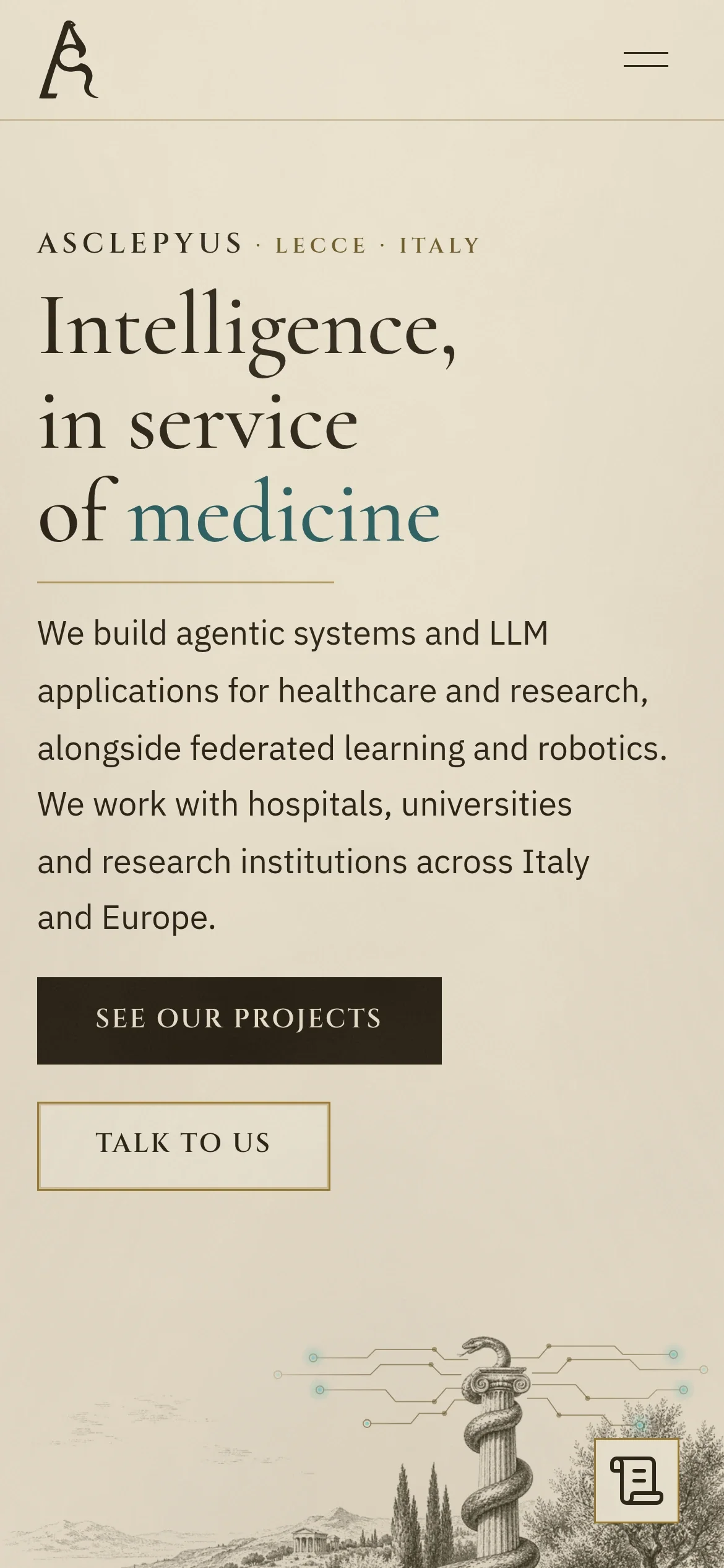
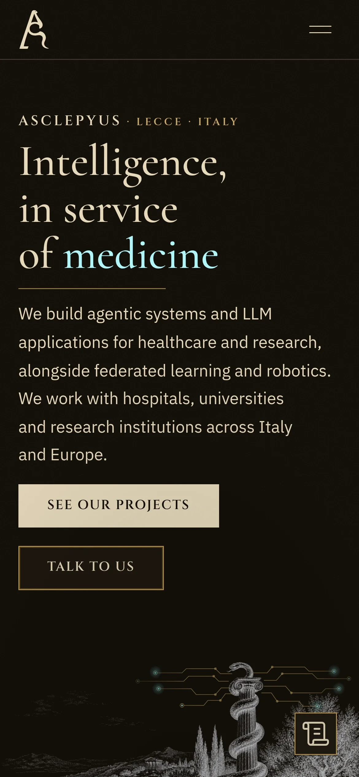
Every engraving is ink only, with no painted paper behind it. A single master sits on parchment in the light theme and inverts cleanly onto the dark one.
It’s a stricter way to draw, but there’s no second set of artwork to keep in sync.
Museum captions and honest records
Images carry figure captions, as in a catalogue, and each project is a record that names its status and its limits.
For a company that handles medical data, saying clearly what a system doesn’t do yet builds more trust than a promise.
One cool colour in a warm palette
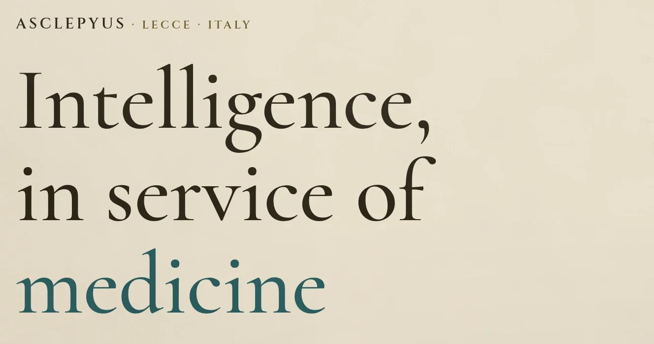
Ink and parchment are warm and stand for the history. The one cool colour, an aquamarine, stands for the AI: the circuit lines leaving the column and the changing last word of the headline.
Keeping the cool colour to that one role makes the idea readable at a glance.
- Parchment
#EBE1CD - Mat
#F2EAD7 - Ink
#241C10 - Soft ink
#57492F - Gold
#9A7B2F - Current
#22585B
On a phone
On small screens the engraving still leads, with the same captions and records.
What changed
Three identical cards became three engraved figures, each with its own caption. Now the pictures show what the company does before the text explains it.
Credits
Lead design: Gabriela Serafin. Engineering: the Asclepyus engineering team. Engravings drawn by hand in Photoshop, then refined with generative AI. The design went through 44 rounds of iteration before it launched on 22 August 2026.