Design system

The rules this catalogue is made from.

The site is built from one grid, two typefaces, one accent colour, a set of paper shapes and content blocks. The studio where Gabriela adds projects offers the same blocks, so a new project looks as if it was always here. A case study can also hang in one of three rooms painted for its kind of work.

I Principles

  1. 1

    Method over costume

    The museum comes in through captions, wall labels, comparisons and details, and nothing is gilded.

  2. 2

    One colour carries meaning

    Ultramarine marks links, numbers and focus. Everything else is paper and ink, so the colours inside the work stay untouched.

  3. 3

    Show the work honestly

    Screens, dates and roles are real, and a number that can’t be sourced stays out.

  4. 4

    Motion confirms a change

    Things move when something has changed: a page arrives, the theme switches, a figure travels to its case study.

II Brand

The wordmark is a hand-drawn signature, kept as a single vector path so it inherits the ink colour in both themes.
The monogram is a G with two cat ears, cut from paper like the other shapes. Traced to one path, it still reads at 16 pixels.
The traced monogram at 16, 32, 48 and 96 pixels.

III Formes

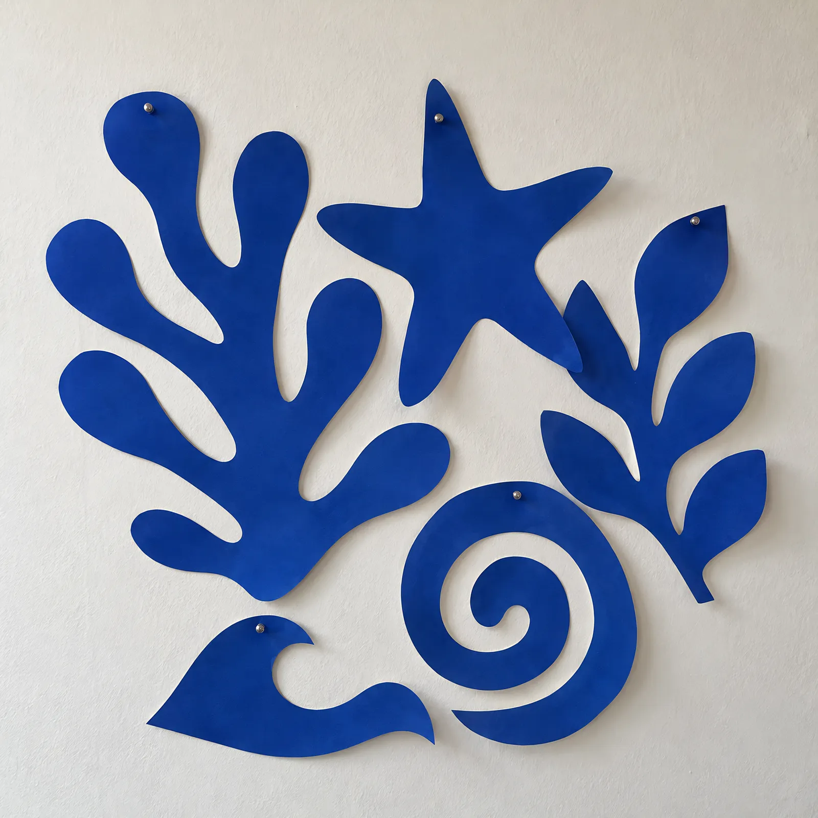
Six shapes cut from ultramarine paper, after Matisse’s papiers découpés. Each has one job on the site. On dark paper the same files are shown brighter.

  1. Algue

    Seaweed. Home page, behind the portrait.

  2. Feuille

    Leaf. Contact and the missing page.

  3. Étoile

    Star. The phone menu.

  4. Corail

    Coral. The method page.

  5. Vague

    Wave. Kept in reserve.

  6. Clé

    Key. The CV request.

The same shape on light and dark paper.

IV Colour

Every neutral carries a trace of the accent’s hue, like a cool museum wall. Both themes come from one set of tokens.

Light

  • Paper--color-paper#F8FAFD
  • Label stock--color-paper-2#EEF0F6
  • Hairline--color-rule#CFD1D5
  • Captions--color-ink-3#5F636C · 5.7:1
  • Secondary text--color-ink-2#3F424A · 9.6:1
  • Text--color-ink#11141A · 17.6:1
  • Ultramarine--color-accent#0A37B7 · 9.0:1
  • Lecture hall--color-hall#0B0F18

Dark

  • Paper--color-paper#0C0F17
  • Label stock--color-paper-2#151922
  • Hairline--color-rule#2C3039
  • Captions--color-ink-3#989BA3 · 6.9:1
  • Secondary text--color-ink-2#BEC1C8 · 10.6:1
  • Text--color-ink#EBEDF1 · 16.3:1
  • Ultramarine--color-accent#77A2FC · 7.6:1
  • Lecture hall--color-hall#03050A

V Type

Libre FranklinDisplay, headings and labels. Impallari Type, 2015, after Morris Fuller Benton’s Franklin Gothic for American Type Founders, 1902.
NewsreaderReading text. Production Type for Google Fonts, 2020, designed by Hugues Gentile under Jean-Baptiste Levée, with optical sizes for long reading on screen.
Display

An art historian’s eye.

Libre Franklin 820 · 2.5–6rem · −0.045em

Heading

Before and after

Libre Franklin 800 · 2–3.25rem

Lead

Trained in the history of art, working in UX.

Newsreader 400 · 1.25–1.5rem

Body

Every image carries a figure caption, as in a catalogue, and every project names its role and status.

Newsreader 400 · 1.1875rem · 1.6

Label

Lead designer · 2026

Libre Franklin 600 · 0.75rem · +0.09em

VI Grid

The grid has twelve columns. Page titles, catalogue entries and wall labels start at the edge. Long reading hangs on one axis, two columns in. Numbers and dates sit above the title they belong to.

VII Blocks

Examples of the studio’s blocks, rendered by the same components the case studies use. Figures are numbered automatically, in reading order.

01 Plate · One image with a numbered caption
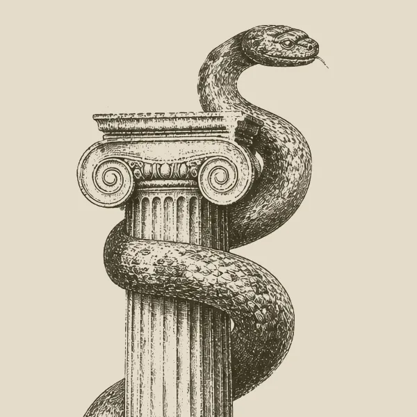
Close-up of an engraved Ionic capital with a serpent coiled around it.
The capital and the serpent from the Atlas column, a detail.
Close-up of an engraved Ionic capital with a serpent coiled around it.
Fig. 1, detailThe capital and the serpent from the Atlas column, a detail.

02 Pair · Two images side by side

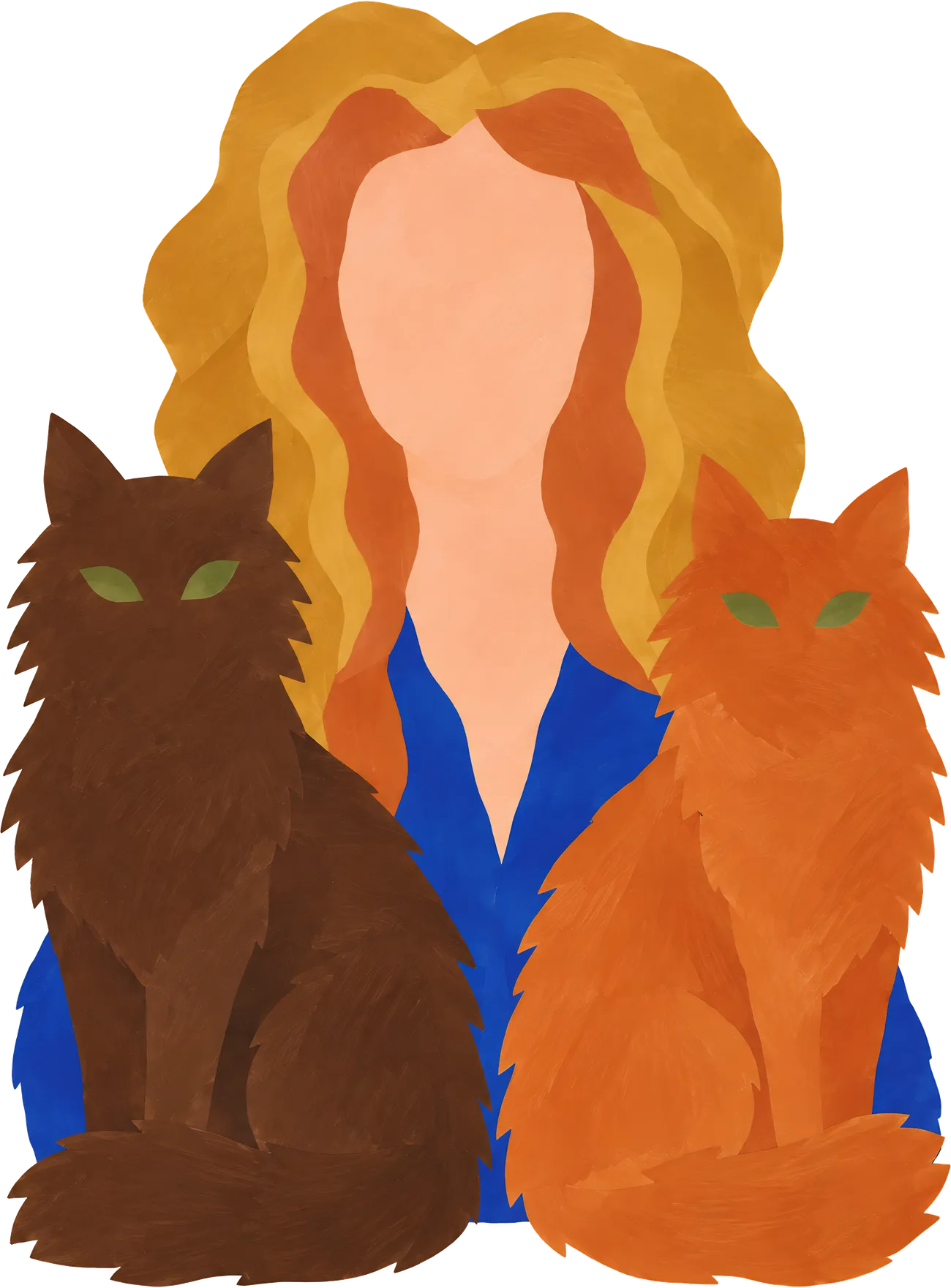
Portrait of Gabriela Serafin with two cats, in cut paper.
The portrait, cut paper.
Portrait of Gabriela Serafin with two cats, in cut paper.
Fig. 2The portrait, cut paper.
Five ultramarine cut-outs pinned to a white wall.
The studio wall, cut paper.
Five ultramarine cut-outs pinned to a white wall.
Fig. 3The studio wall, cut paper.

03 Before and after · Two slides on a dark band

Before and after

Two slides side by side on a dark band, as in an art history lecture.

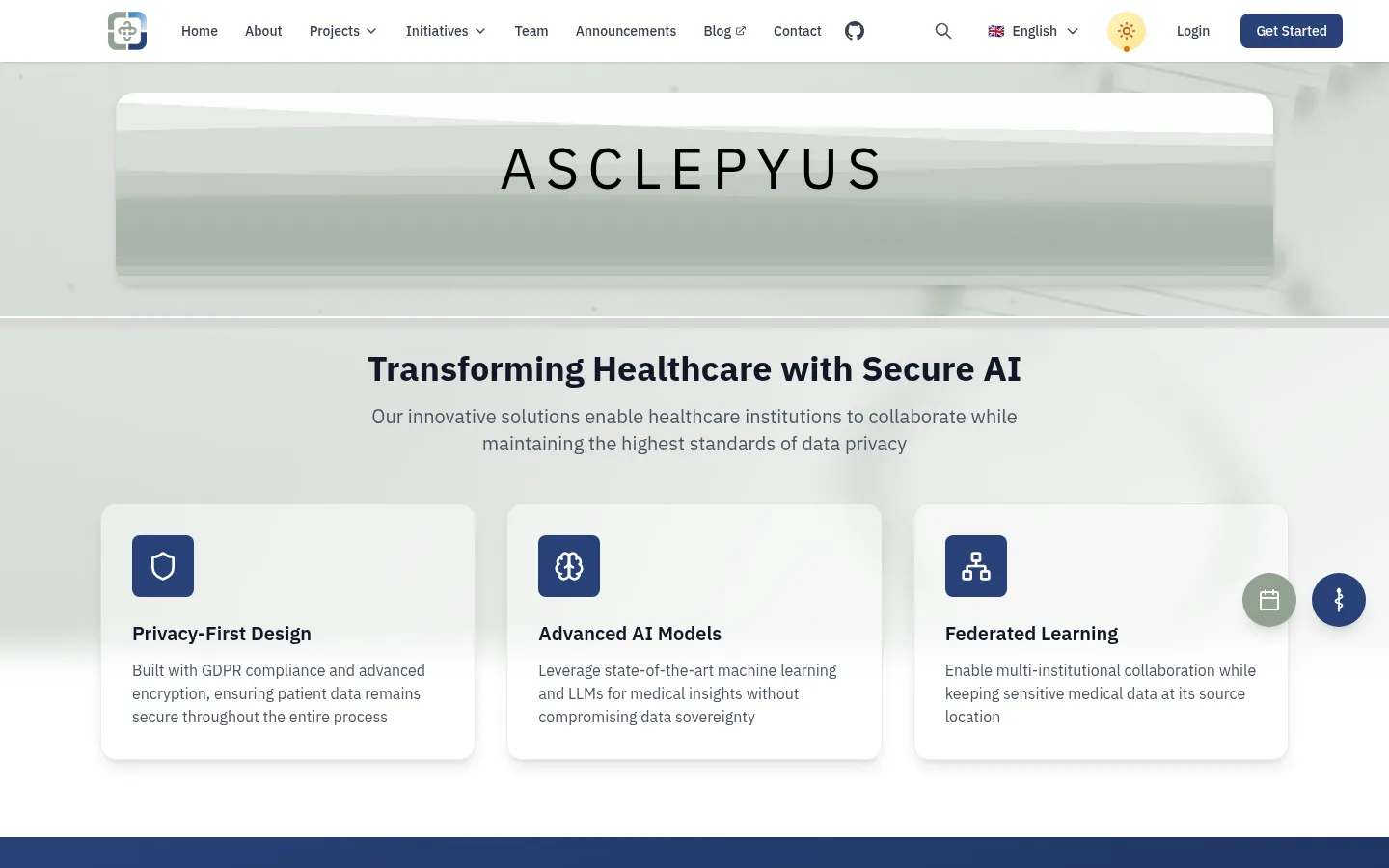
The previous Asclepyus home page with a glassy banner and three cards.
The Asclepyus home page before the redesign.
The previous Asclepyus home page with a glassy banner and three cards.
Fig. 4 The Asclepyus home page before the redesign.
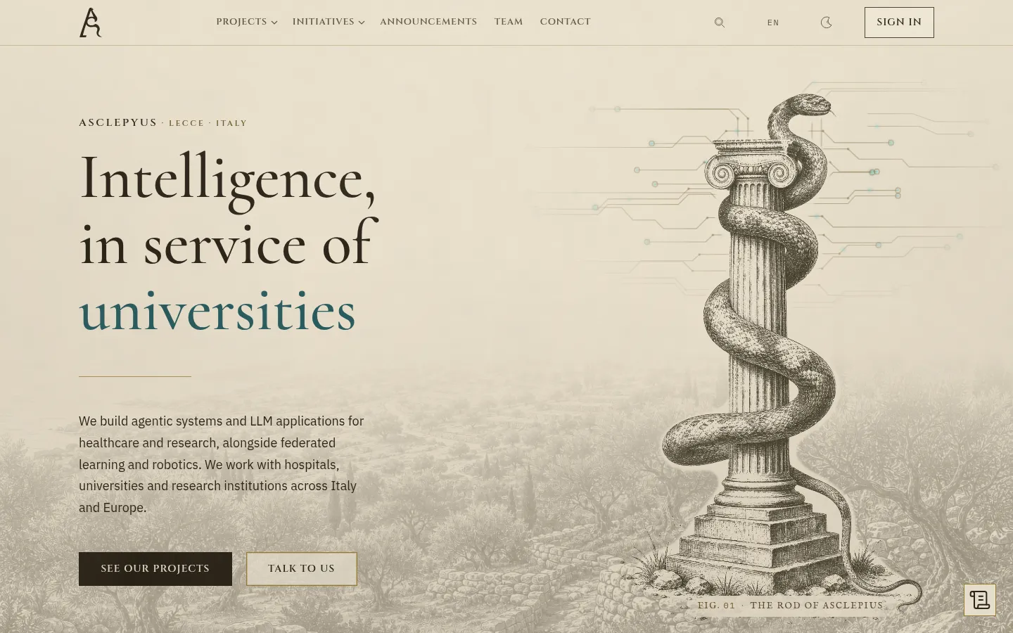
The redesigned Asclepyus home page with an engraved column.
The same screen after it.
The redesigned Asclepyus home page with an engraved column.
Fig. 5 The same screen after it.

04 Decision · A numbered design decision

Every figure gets a caption

A caption says what the image shows and when it was made.

It costs a line of text, and it lets a reader trust the picture.

05 Quotation · Words from someone, with the source

Cutting directly into colour reminds me of the direct carving of sculptors.

Henri Matisse, Jazz, 1947

06 Video · YouTube or Vimeo, loaded on click

Tate’s film about the cut-outs. · From YouTube

07 Figma · A prototype or file, loaded on click

Gabriela’s prototype from the Google UX Design Certificate, 2022. · From Figma

08 Palette · The colours of a project

This site’s palette in the light theme
  1. Paper#F8FAFD
  2. Label stock#EEF0F6
  3. Text#11141A
  4. Captions#5F636C
  5. Ultramarine#0A37B7
  6. Lecture hall#0B0F18

09 Chronology · Dated phases drawn to scale

  1. Jan 1943–Dec 1947Jazz
  2. Jan 1948–Dec 1951Chapel of the Rosary, Vence
  3. Jan 1952–Dec 1952The Swimming Pool
Fig. 6Matisse’s cut-out years, drawn by year.

10 Gallery · Two to twelve images in a grid

Interface parts

Atlas

Client
Asclepyus
Role
Lead designer
Status
Live since 22 August 2026

VIII Rooms

A case study can hang in a room painted for its kind of work, the way a museum repaints its walls for an exhibition. A room changes the walls, the display type and the furniture of the page. The reading face, the grid and the rules on this page stay, and each room keeps to one accent.

Theatre programme

For events and culture

  • Paper
  • Ink
  • Accent
  • Hall
Faces
Anybody, a variable face with a width axis
Furniture
A poster bill beside the cover, the wall label as a ticket, acts in Roman numerals, the lecture hall as a stage.

Departure board

For travel

  • Paper
  • Ink
  • Accent
  • Hall
Faces
Overpass and Overpass Mono
Furniture
A yellow timetable by day and a split-flap board by night, platform signs for chapters, the hall as a night platform.

Bookshop

For books and retail

  • Paper
  • Ink
  • Accent
  • Hall
Faces
Young Serif and Courier Prime
Furniture
An open book with a frontispiece, the wall label as a catalogue card, a table of contents, the hall as a reading room.

IX Motion

Motion uses three durations and one curve, which starts fast and settles without bouncing.

  • --ease-outcubic-bezier(0.16, 1, 0.3, 1)
  • --ease-incubic-bezier(0.7, 0, 0.84, 0)
  • --ease-in-outcubic-bezier(0.65, 0, 0.35, 1)
  • --dur-short160 ms
  • --dur-medium320 ms
  • --dur-long900 ms
Between pages
The header stays still while the page changes under it, and a case study’s cover grows out of its figure on the home page.
Theme
The switch cross-fades the whole page instead of flashing it.
On scroll
Chronology bars are drawn as they come into view.
Open a case study

Visitors who ask their system for less motion get none of this: pages change instantly and the bars are already drawn.

X Writing

The words follow rules too. They were checked against common signs of AI writing.

  1. No em dashes. A comma, a full stop or brackets do the job.
  2. First-person text uses contractions, the way people talk.
  3. A claim needs a source: a CV, a project record or a live page.
  4. Captions say what the image shows and when it was made.
  5. Polish follows Polish catalogue usage: Ryc. for a figure, Tabl. for a plate, fragment for a detail.

Before I am an empathetic, detail-oriented designer.

After I came to interface design from the history of art.

XI Access

Contrast
The faintest text on the site, the captions, is 5.7:1 on light paper and 6.9:1 on dark. Body text is above 16:1 in both.
Focus
A two-pixel ultramarine outline, set off from the element. Every control can be reached with the keyboard.
Images
The studio refuses to publish a figure without a description.
Honesty
Checked with automated tools and by hand. Tools can’t catch everything, so treat this as a record of those checks.