
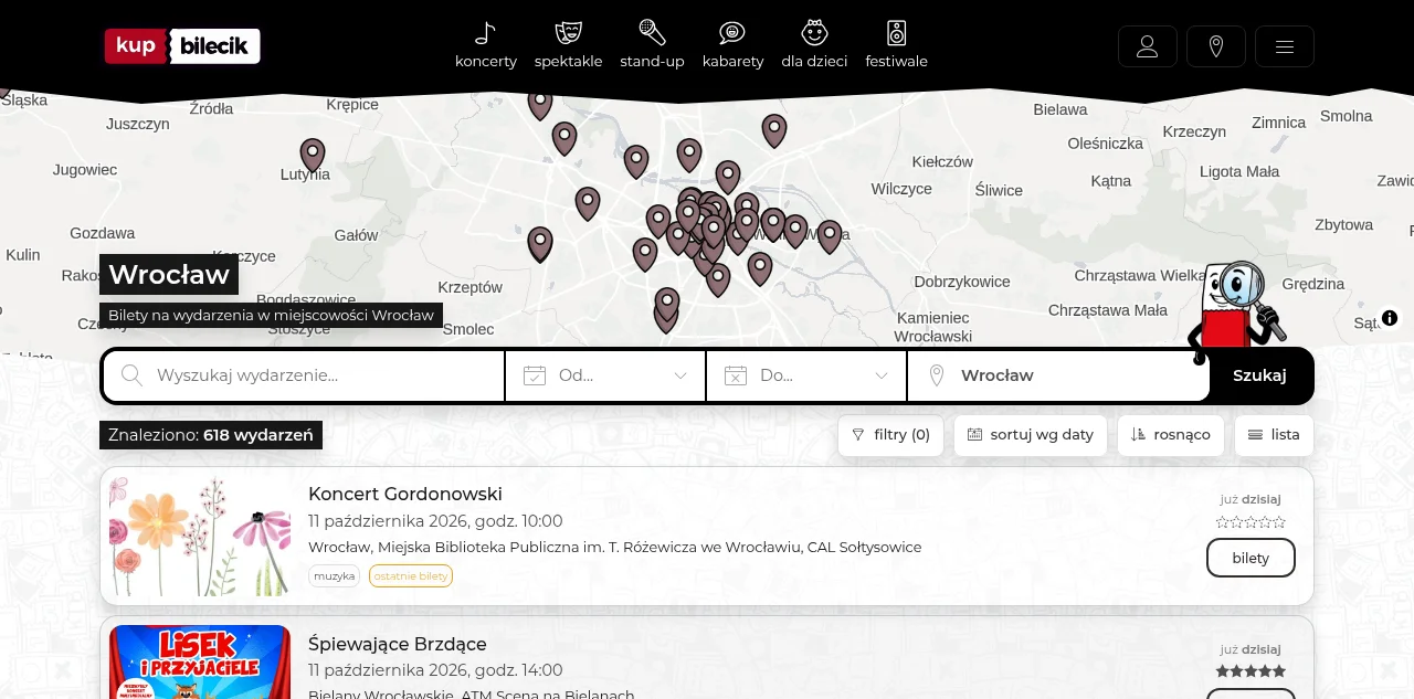
Pl. I KupBilecik’s public results for Wrocław, captured before any ticket selection. The study starts from this screen.
I explored how an occasional planner could compare an evening out for two. A public-site review led to an interactive proposal for clearer search boundaries, adjacent-seat prices and recovery when a seat becomes unavailable.
An outing starts before a ticket
The search says Wrocław, yet a few of the results are in nearby towns. One performance runs at more than one time. The ticket price isn't on the list at all; it sits a step further in.
So before anyone picks a seat, there's a smaller decision to make: which of these evenings is worth bringing up with the person you're going with?
I took that moment as the starting point for an independent concept study. My question was how the interface could help someone carry a plan from browsing to ticket selection without losing the details that made the plan possible. In the working prototype further down, you can change those details and watch what happens when a seat stops being available.
Everything here comes from a review of the public site and the design work that followed it. KupBilecik didn't commission the study. I had no platform analytics, organiser data or access to customer research; the personas and the scenario critique are synthetic, and every performance in the prototype is fictional. There are no interview findings or sales results to report.
What I could actually see
I followed the public Wrocław results into one event and its seat map, with no seats selected, and stopped there: before choosing live seats, creating a reservation or entering personal details. Whatever happens later in checkout is outside what I saw.
On the pages I inspected, four things stood out:
- The event cards showed dates, venues and availability, but no ticket price.
- The Wrocław list included surrounding towns.
- On mobile, the radius slider reported a value of 50 to the accessibility tree but showed no number and no endpoints on screen.
- On desktop, the booking progress named seven stages; the mobile seat overview numbered them instead.
I treated each one as a question. A missing price on the card might make comparison harder, though it might also reflect a difficult inventory contract. A wide search area could surprise someone who only wanted the city and help someone with a car. The design had to show those choices without pretending I already knew which one mattered most.
Fig. 1 Interactive exhibit
Read the evidence beside the interpretation
Choose an observation to see its source, the question it raises and where the claim stops.
A price needs a basis
The reviewed result cards didn't show a ticket price. That shows a gap in what this view discloses. It says nothing about abandoned purchases.
For the concept, I based the total for two on a specific available adjacent pair, including the configured order fee.
- Basis for the decision
Public results review.
- Design response
Calculate a fixture pair before displaying its total. State what the amount excludes.
The area has a boundary
The inspected Wrocław results included nearby towns. In the reviewed mobile state, the radius had no visible number and no endpoints.
The proposal makes the distance visible and explains where it's measured from. It can't turn kilometres into a promise about the journey home.
- Basis for the decision
Public desktop/mobile review.
- Design response
Show the value, unit, endpoints and distance meaning together.
The later checkout is unknown
The review stopped at the seat overview, before any seat was selected. Nothing about payment, delivery or reservation expiry follows from it.
So I narrowed the working exhibit to event choice, seat selection and a simulated availability conflict.
- Basis for the decision
Review boundary recorded before design.
- Design response
Finish with an explicitly simulated summary, with no payment or issued ticket.
What the interface shows is enough to ask a design question. It can't say how often customers run into the problem.
Finding a useful research question
My audience hypothesis is an occasional planner arranging an outing with another adult, someone who may start from a date or a spending limit and only find the event later.
A regular searching for a named performer is the useful counterexample: a guided questionnaire would only put work in their way before a simple search.
I framed the research around a recent outing: what was already fixed before the event was chosen? An interview would reconstruct one real attempt, including an abandoned one, with the participant's own links or calendar if they want to share them. Asking whether a budget filter sounds useful would only invite agreement with my solution and tell me little about the actual decision.
The approach follows GOV.UK guidance on research in discovery. I'd recruit beyond designers and friends, include people with different transport and access needs, and keep what someone remembers apart from what they do during a session. None of these sessions has happened yet.
The original brief also sets a stopping rule for the guided planner: continue only if date or place organizes at least three of six reconstructed core episodes before an event is chosen. That's an investment decision made on a small recruited sample, so it can't estimate what the wider population prefers, and synthetic scenarios can't count towards it.
A synthetic objection changed the brief
Before treating these controls as a complete answer, I tested them against an AI-generated scenario: a shift worker planning an evening with an older cousin, getting around by bus and using a small phone with enlarged text. No real person took part and no behaviour was observed. The scenario was there to raise objections.
The sharpest one was about distance. A venue close by with an awkward late journey home could be a worse choice than a farther one on a direct bus route.
The same critique asked whether a budget for two includes fees and transport, and whether “available” means two seats together. Both are worth checking, although a simulation can't tell me how real people would rank them.
Fig. 2 Interactive exhibit
Follow the constructed outing
Step through the scenario generated for this critique. Each step pairs one objection with the design decision it led to.
A shift ends before the show
The constructed planner needs an event that fits a changing work roster and a companion’s evening.
A date belongs to a particular performance. A production title on its own would leave the decision incomplete.
- Basis for the decision
AI-generated scenario; no participant.
- Design response
Repeat the selected performance date beside the seats and cost.
A shorter distance can mean a harder return
The critique set a nearby late event against a farther one served by a direct bus home.
The prototype has no timetable or journey data. Its radius is a geographic filter, and the interface says so.
- Basis for the decision
Constructed comparison; no observed journey.
- Design response
Explain the distance definition and leave transport feasibility unconfirmed.
Two tickets need two suitable seats
A companion using a cane may need an aisle and step-free entry. Consecutive seat numbers guarantee neither.
The exhibit defines adjacency and shows the selected numbers. It marks the venue's access information as unverified.
- Basis for the decision
AI-generated access-needs scenario; no accessibility validation.
- Design response
Keep adjacency, venue access and transport as distinct questions.
Keeping criteria can also keep an impossible search
After a seat conflict, a preserved budget only helps if the person can see why the options changed.
The proposed recovery repeats the criteria, then either offers a qualifying pair or asks for an explicit change.
- Basis for the decision
Constructed recovery critique; comprehension remains untested.
- Design response
Show retained conditions beside the conflict message.
Keep the geography honest
I kept the radius as a bounded filter and gave it a visible number, endpoints and a definition. The concept measures straight-line distance from a stated reference point.
A radius of zero means that point itself. A production “Wrocław only” option would need its own boundary rule. The prototype makes no claim about bus connections or journey time.
Three structures and what each one costs
I considered three structures, and each supports a different kind of work:
- a clearer local catalogue, which helps someone scan;
- an optional evening planner, which asks for constraints first;
- a persistent shortlist, which carries a comparison between options.
Building all three would bury the unresolved research question inside a bigger product.
Fig. 3 Interactive exhibit
Inspect the alternatives
Select a concept to see what it asks of the planner and what evidence would justify building it.
Make the catalogue easier to compare
Keep direct event discovery and put practical facts in a stable order. Show a defined area, a pair-price basis and the exact performance.
This is the smallest intervention I can inspect with a fixed dataset. People still assemble their own plan, and the design doesn't solve coordination with a companion.
- Design response
Use the catalogue as the working baseline while research is outstanding.
Ask for the evening first
An optional entry could ask for place, availability and party size before showing possible events.
The extra steps could hide an appealing option or frustrate someone who already knows the performer. The concept needs the interview criterion described above and a clear way to revise the inputs.
- Design response
Defer the guided entry until real episodes justify it.
Carry a shortlist between people
A comparison could put two or three performances beside their venue and cost assumptions.
Saved links or ordinary messaging may already do this well. A persistent shortlist would need evidence of repeated comparison work, plus rules for sharing and expiry.
- Design response
Keep the concept available for research; omit persistence from this prototype.
Whichever structure survives, the content model matters. A production can have several performances. Each performance belongs to a venue and has its own ticket inventory, and a price band doesn't guarantee an adjacent pair. Spelling those relationships out helped me decide what a search result could promise and what had to be checked again once someone picked seats.
If real discovery turns up conflicting ways of grouping events, card sorting could help find the vocabulary. A tree test could then check the routes to another performance, a venue's access information or ticket help. Card sorting and tree testing answer different questions, and neither would show whether a seat map is readable or a total is understood.
Put the practical facts into the comparison
The first image records the service as I inspected it. The second turns the design hypothesis into something you can look at.
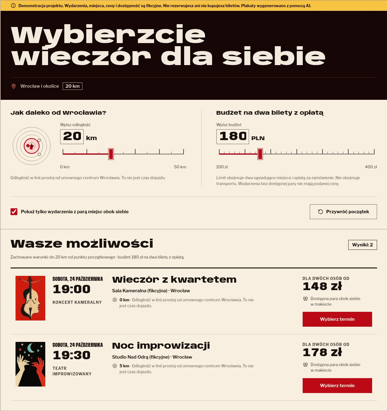
Proposed performances, seat inventory and prices are fictional. These images do not establish a measured improvement.
Try the proposed decision
The working slice covers a small catalogue and seat selection. A few things to try:
- change the distance and the budget independently;
- include events that have no adjacent pair;
- choose a performance and compare the seat map with the list.
The interface is in Polish on purpose. A proposal should expose the language people would actually have to interpret when they decide.
Each card's total is the cheapest available adjacent pair in the fixture plus one order fee, so two cheap seats that aren't next to each other can't produce it. Once you pick seats, the summary names both and adds up their amount. Review needs adjacent seats inside the saved budget and search area. Go outside either limit and the interface shows the conflict and waits for a deliberate change.
Fig. 6 Interactive exhibit
Plan an evening and inspect the failure
The catalogue, prices and seat inventory are fictional. Try the controls, switch between map and list, and trigger an unavailable-seat response.
Try a 20 km radius and a 180 PLN budget for two, choose a performance, then select adjacent seats. Switch to the list or simulate a lost seat to inspect recovery.
Demonstracja projektu. Wydarzenia, miejsca, ceny i dostępność są fikcyjne. Nie rezerwujesz ani nie kupujesz biletów.
Wybierzcie wieczór dla siebie
Wrocław i okolice20 km
Wasze możliwości
Zachowane warunki: do 20 km od punktu początkowego · budżet 180 zł na dwa bilety z opłatą.
Żadna dostępna para nie spełnia tych warunków
Możesz zwiększyć budżet albo odległość. Zmiana jednego warunku zachowuje pozostałe. Nie rozszerzamy wyszukiwania automatycznie.
- Sobota, 24 października19:00Koncert kameralny
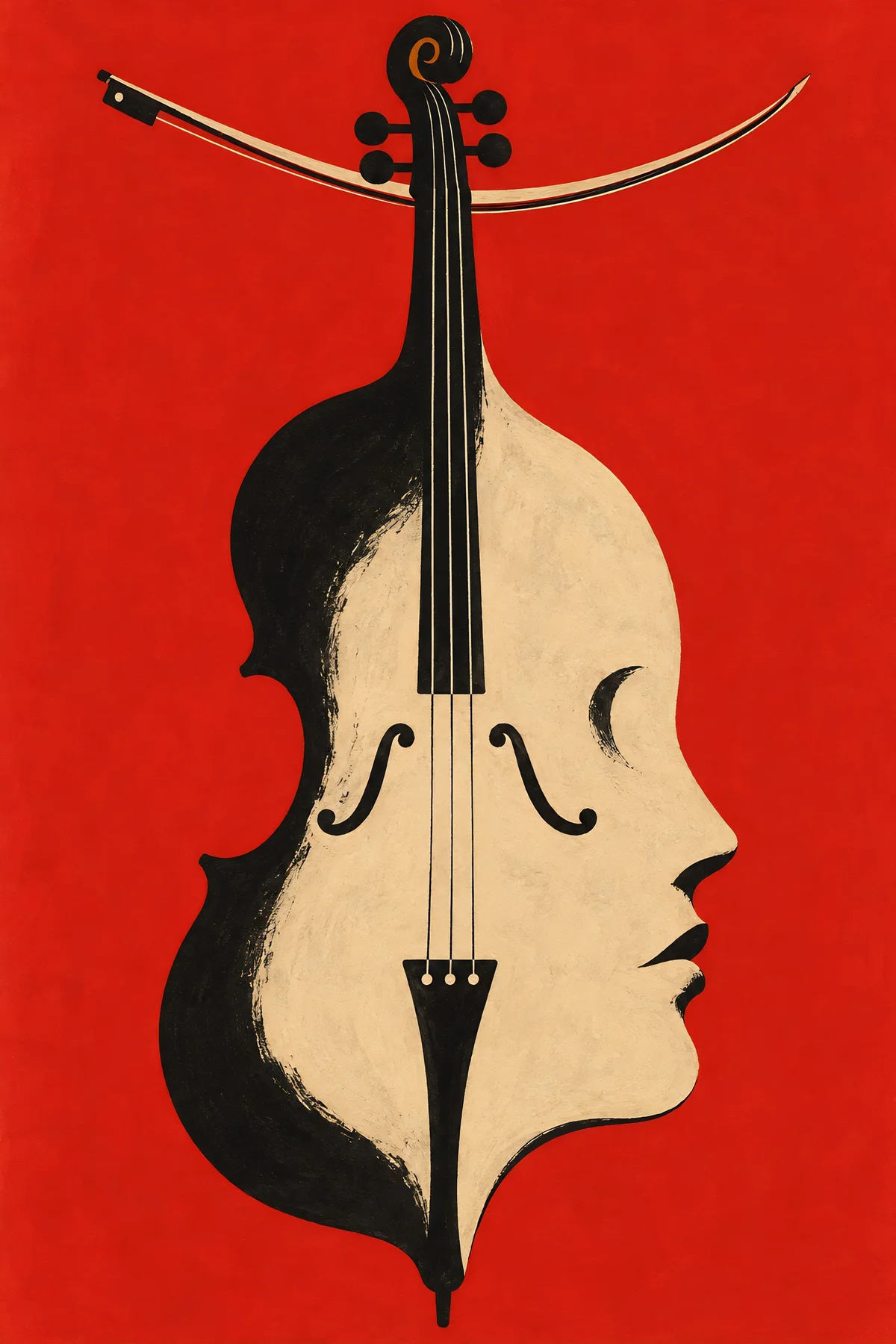
Wieczór z kwartetem
Sala Kameralna (fikcyjna) · Wrocław
0 km · Odległość w linii prostej od umownego centrum Wrocławia. To nie jest czas dojazdu.
Dla dwóch osób od 148 zł
Dostępna para obok siebie w makiecie
- Sobota, 24 października18:00Spektakl
Komedia na sobotę
Mała Scena (fikcyjna) · Oleśnica
30 km · Odległość w linii prostej od umownego centrum Wrocławia. To nie jest czas dojazdu.

Dla dwóch osób od 118 zł
Dostępna para obok siebie w makiecie
- Sobota, 24 października20:00Recital
Piosenki przy fortepianie
Sala przy Rynku (fikcyjna) · Bielany Wrocławskie
10 km · Odległość w linii prostej od umownego centrum Wrocławia. To nie jest czas dojazdu.

Dla dwóch osób od 188 zł
Dostępna para obok siebie w makiecie
- Sobota, 24 października18:30Spektakl
Opowieści z małej sceny
Scena Miejska (fikcyjna) · Trzebnica
25 km · Odległość w linii prostej od umownego centrum Wrocławia. To nie jest czas dojazdu.
Dla dwóch osób od
Brak dwóch miejsc obok siebie
- Sobota, 24 października19:30Teatr improwizowany
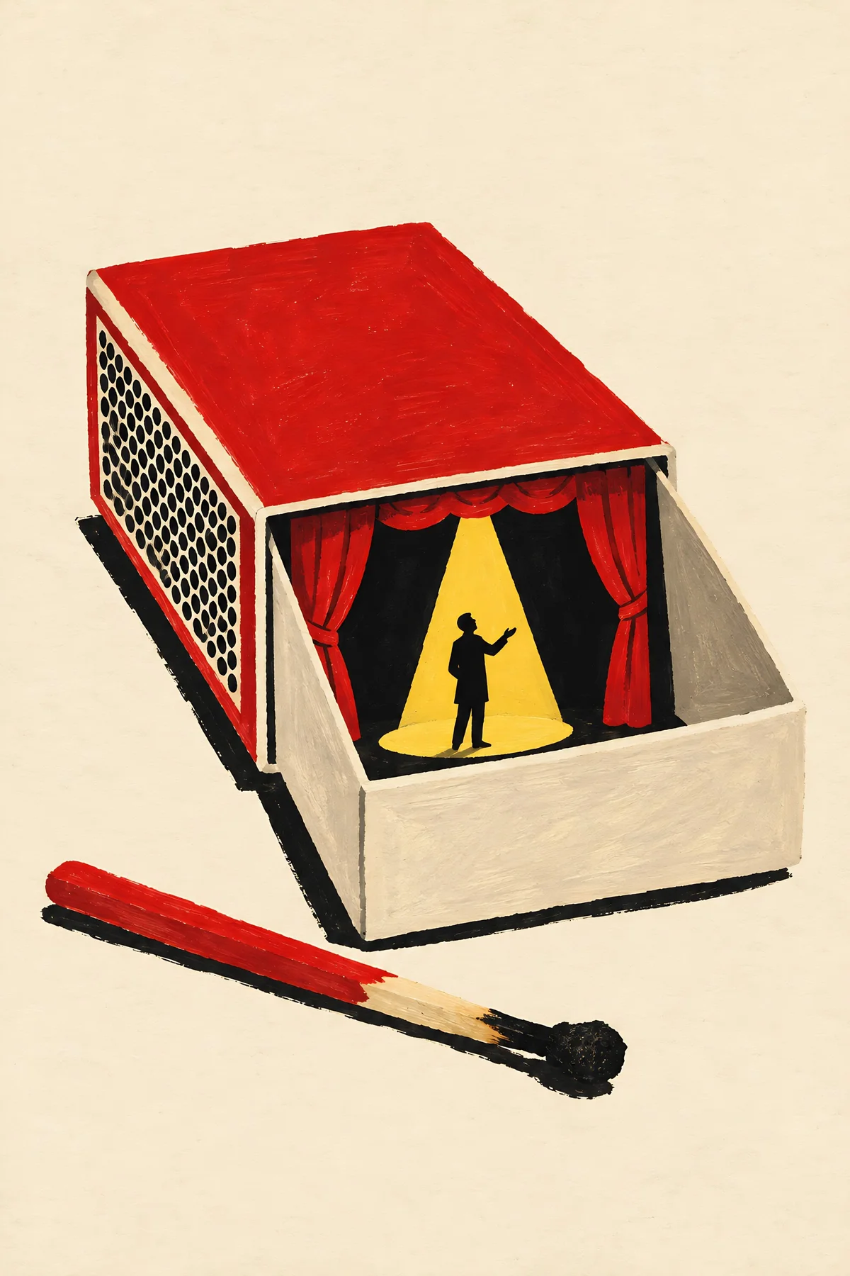
Noc improwizacji
Studio Nad Odrą (fikcyjne) · Wrocław
5 km · Odległość w linii prostej od umownego centrum Wrocławia. To nie jest czas dojazdu.

Dla dwóch osób od 178 zł
Dostępna para obok siebie w makiecie
Wybierzcie dwa miejsca
Obok siebie oznacza kolejne numery w tym samym rzędzie i sektorze. Wybrane miejsca pojawią się w podsumowaniu. Przekreślony numer jest niedostępny.
Scena
- Dostępne
- Wybrane
- Niedostępne
Scena
- Dostępne
- Wybrane
- Niedostępne
Scena
- Dostępne
- Wybrane
- Niedostępne
Scena
- Dostępne
- Wybrane
- Niedostępne
Scena
- Dostępne
- Wybrane
- Niedostępne
Ta makieta nie potwierdza dostępności wejścia, miejsc przy przejściu ani powrotu transportem publicznym. Te informacje wymagają sprawdzenia u organizatora i przewoźnika.
Recover the choice without hiding the change
Losing a seat removes that position; the performance, search area and budget stay visible. The other seat stays selected. The recovery action looks for another adjacent pair at the same performance inside the same budget.
A replacement can cost more, so its numbers and total have to be reviewed again. If no pair qualifies, the interface asks for an explicit change. It doesn't widen the search or spend more on the person’s behalf.
The list is part of the same choice
The seat map and the list share one selection. Switch views and the chosen seats and the amount stay where they were.
- Each control names the section, row, number and price.
- The list states availability in words. On the map, an unavailable seat has its number crossed out.
- Every seat is a native button, so the whole selection works without dragging the map.
- The radius has a numeric field as well as a slider. W3C guidance on dragging movements treats an alternative to dragging and keyboard access as separate needs: the field covers the first, and the slider also works from the keyboard.
- Changes to the selection and the results get a brief visual confirmation, and meaningful updates are announced. Reduced motion removes the movement.
These choices sit inside a bounded simulation and make no claim about the whole checkout. Screen-reader use, enlarged text and the labels still need testing with the people who rely on them.
What would justify taking it further
Taking it further would mean three stages of work.
- Before anyone sees this proposal, I'd ask people to reconstruct a recent outing. I'd look for the constraints that were already fixed, the events they rejected and the point where the companion joined in. The synthetic critique gives me questions to bring; it can't decide the scope or supply the answers.
- A later session with the prototype would ask someone to find an evening for two, explain the search area and the total, then recover from a lost seat. I'd record the chosen performance and seats, misunderstandings, any help given and the reason for a changed choice. Timing during think-aloud would be diagnostic. A small moderated sample would support specific revisions without establishing a sales effect.
- Production would need organiser-backed venue information, an inventory and pricing contract, and the service's real hold and expiry rules. Transport stays a separate dependency.
I left those promises out of the working slice on purpose, because a plausible-looking answer is harder to challenge than an explicit unknown.
The prototype ends with two seat numbers and a total that can still change. Press the unavailable-seat control and one number disappears while the original budget stays beside it. That's the moment I want a real participant to look at next: whether the plan they kept and the choice that changed are both clear enough to carry on.